Embedded analytics SDK (beta)

Build custom in-app analytics, fast

The development toolkit for in-app reporting that looks, acts, and smells like it’s part of your app. Get full control to prototype, style, and ship sophisticated analytics without complicated development.

npx @metabase/embedding-sdk-react@latest start
Explore the live demo Go to quickstart

Multi-tenant and secure

Make sure customers only see what they need to. Your data never leaves your server.

Get started in minutes

Install the SDK and embed your first chart fast. Build out advanced analytics as needs grow.

Rich documentation and support

Developer-first tools and expert support to keep the integration process on your schedule.

Metabase is trusted by over 60,000 companies
open-ai logo mcdonalds logo huma logo capital-one logo airbyte logo betterment logo Deutsche Telekom logo kong logo

Integrated with your UI

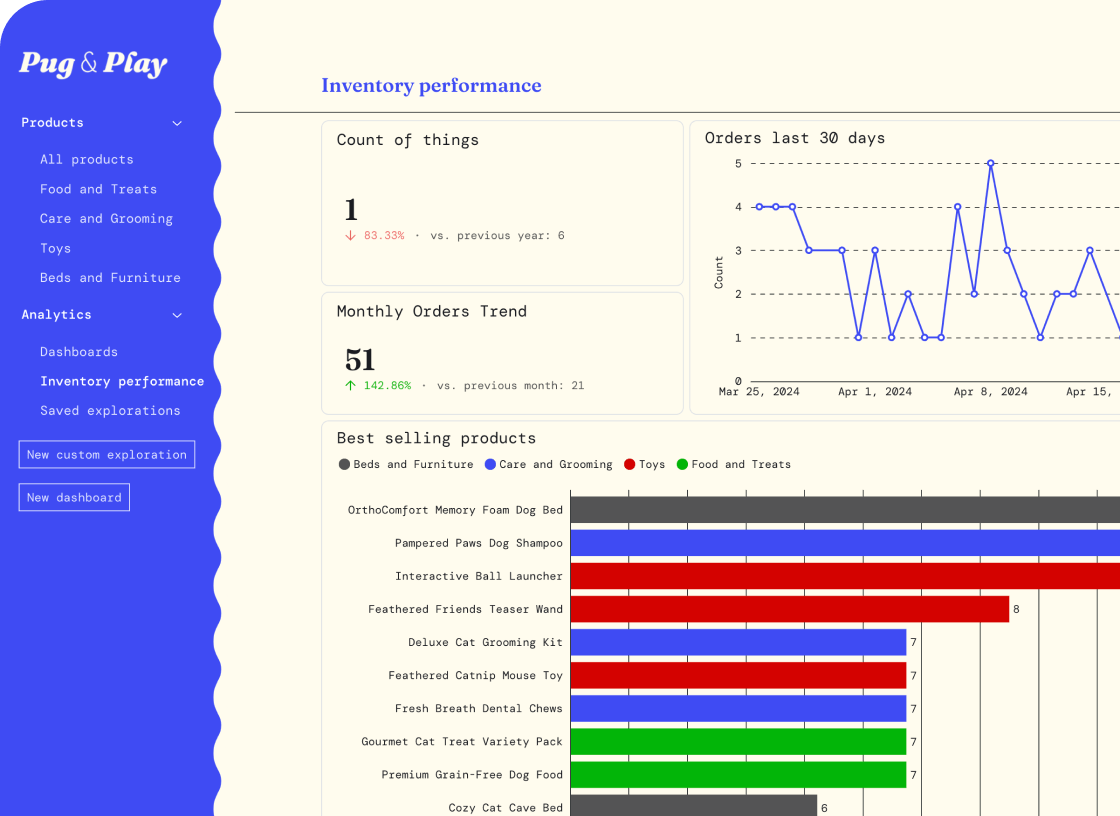
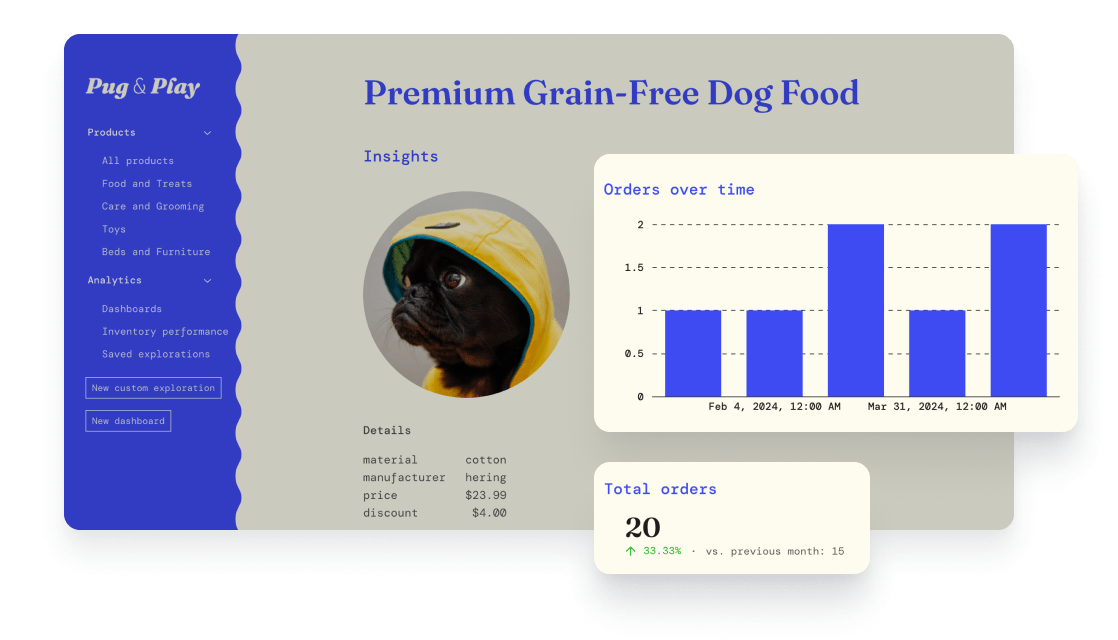
Embed standalone components—from individual charts to the query builder—that blend into your product. Pixel-perfect placement with no fixed width or height for responsive designs. Override menus, rearrange fields, move buttons, and lay out components to fit your UI.

        
import {
  MetabaseProvider,
  InteractiveQuestion,
  defineEmbeddingSdkConfig
} from "@metabase/embedding-sdk-react";

const config = defineEmbeddingSdkConfig({
  metabaseInstanceUrl: "https://metabase.example.com", // Required: Your Metabase instance URL
  authProviderUri: "https://app.example.com/sso/metabase", // Required: An endpoint in your app that signs the user in and returns a session
});

<MetabaseProvider config={config}>
  <InteractiveQuestion
    questionId={questionId}
    isSaveEnabled={false}
    withResetButton={true}
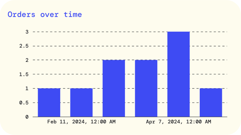
    customTitle="Orders over time"
  />
</MetabaseProvider>


Dynamic theming

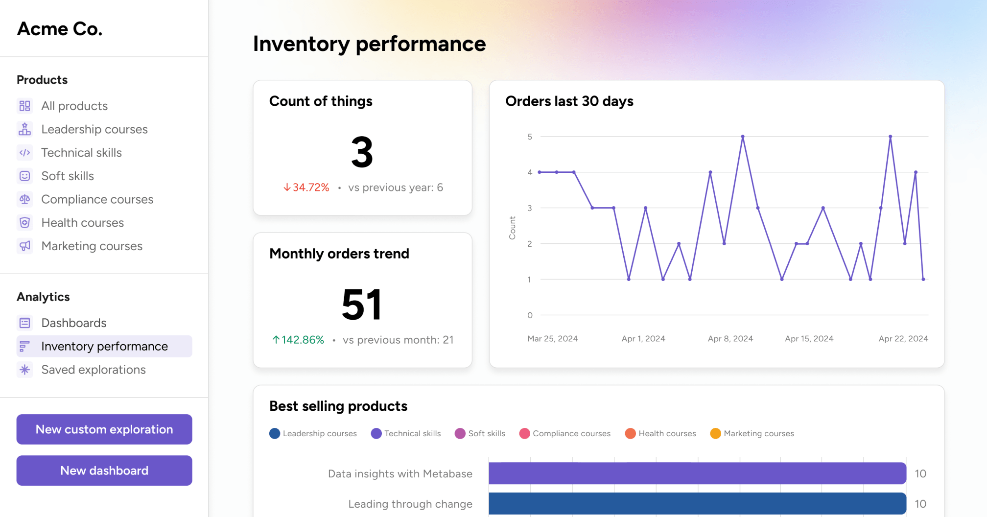
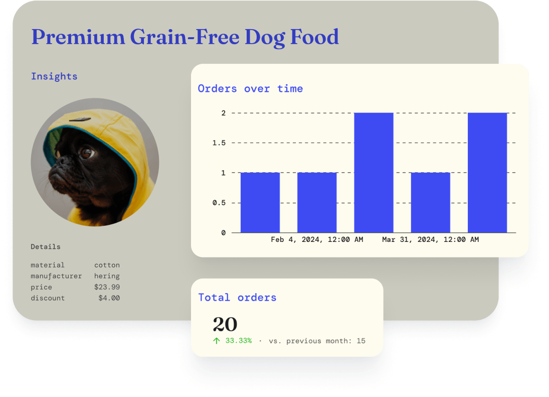
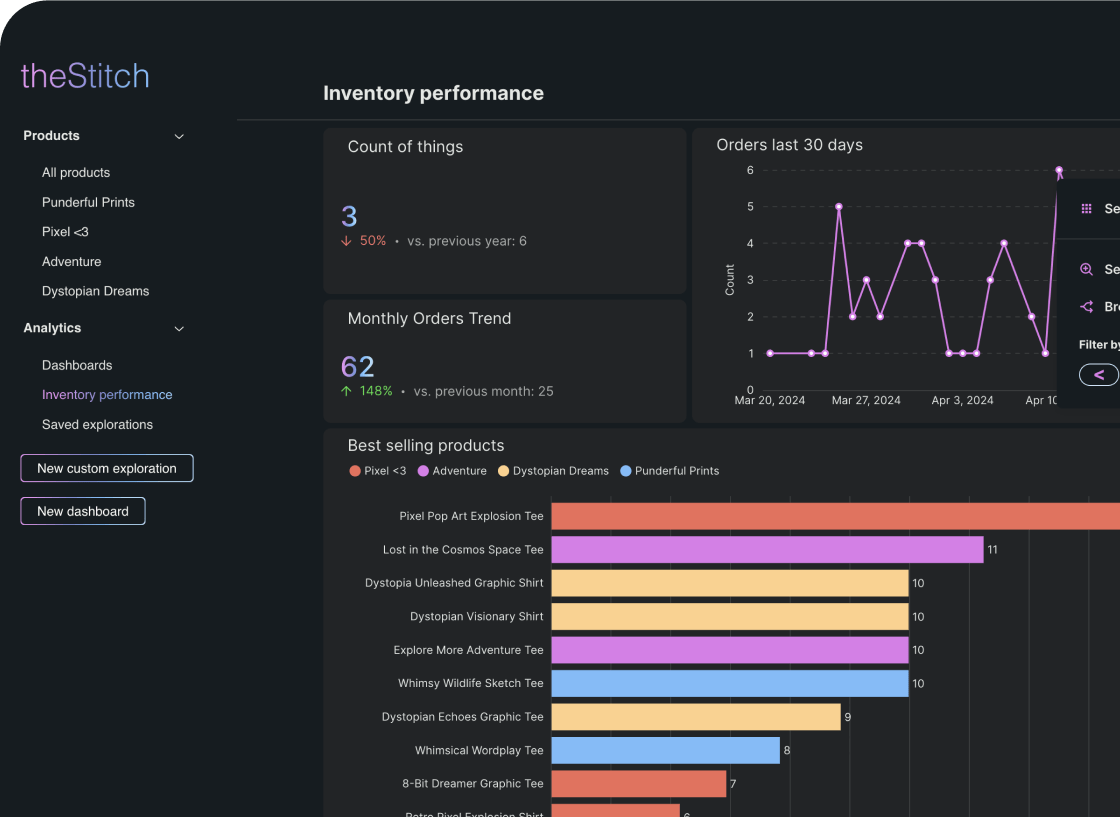
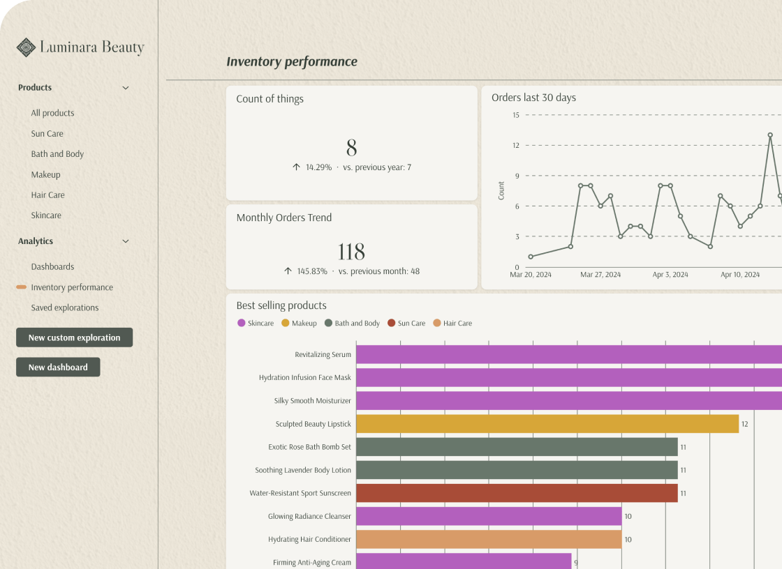
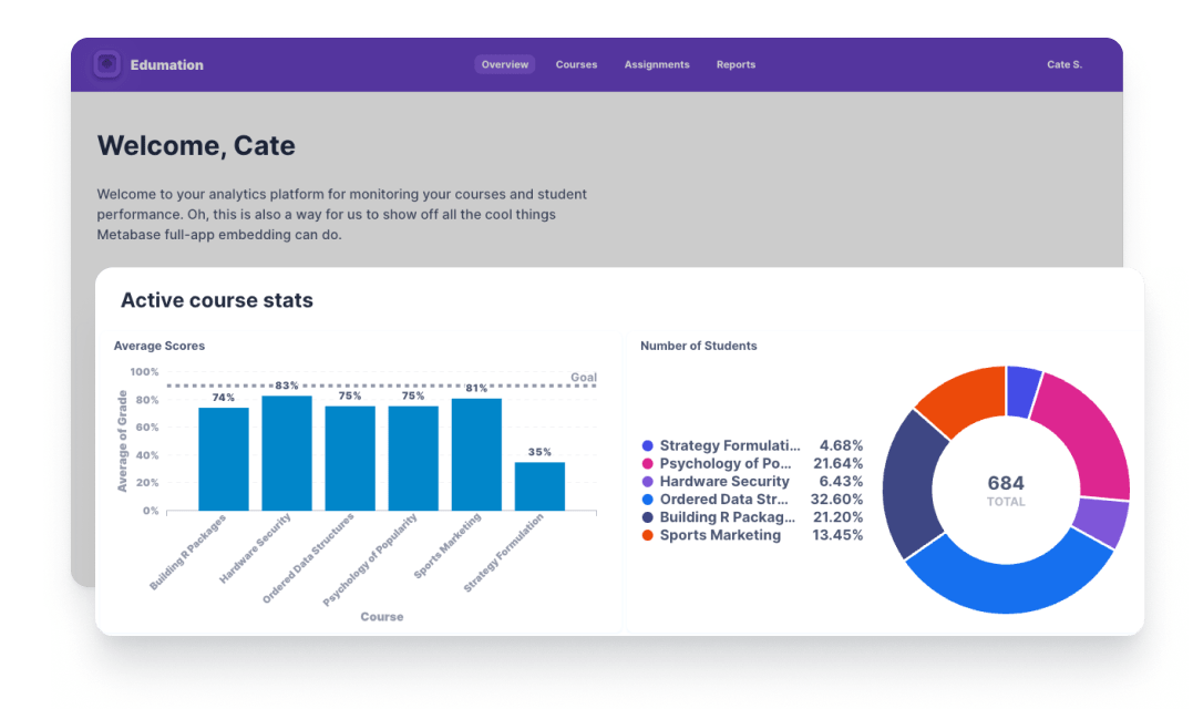
Style each component to match your app’s look and feel. Customize fonts, background colors, tooltips, shading, and more. Apply different styles per organization, team, or even per user.

        
const metabase: MetabaseTheme = {
  fontFamily: "Inter",
  fontSize: "14px",
  colors: {
    brand: "#DF75E9",
    "brand-hover": "#3B3F3F",
    "brand-hover-light": "#3B3F3F",
    filter: "#7ABBF9",
    "text-primary": "#E3E7E4",
    "text-secondary": "#E3E7E4",
    "text-tertiary": "#E3E7E4",
    border: "#3B3F3F",
    background: "#151C20",
    "background-secondary": "#3B3F3F",
    "background-hover": "#151C20",
    "background-disabled": "#3B3F3F",
    charts: [
      "#DF75E9",
      "#7ABBF9",
      "#ED6A5A",
      "#FED18C",
      "#82A74B",
      "#FF8D69",
      "#ED6A5A",
      "#FED18C",
    ],
    positive: "#45DF4C",
    negative: "#FF3389",
  },
  components: {
    cartesian: {
      padding: "6px 16px",
    },
    dashboard: {
      card: {
        border: "1px solid #3B3F3F",
        backgroundColor: "#212426",
      },
    },
    number: {
      value: {
        fontSize: "18px",
        lineHeight: "22px",
      },
    },
  },
}


const metabase: MetabaseTheme = {
  fontFamily: "DM Mono",
  fontSize: "14px",
  colors: {
    brand: "#3F4BF3",
    filter: "#3F4BF3",
    "text-primary": "#1B1C21",
    "text-secondary": "#545455",
    "text-tertiary": "#545455",
    border: "#3B3F3F",
    background: "#FFFCEE",
    "background-hover": "#FCFAF1",
    "background-disabled": "#D1CFC5",
    charts: [
      "#3F4BF3",
      "#D30100",
      "#ECB405",
      "#BD37C9",
      "#00B509",
      "#545455",
      "#3F4BF3",
      "#D30100",
    ],
    positive: "#00B509",
    negative: "#D30100",
  },
  components: {
    cartesian: {
      padding: "6px 16px",
    },
    dashboard: {
      card: {
        border: "1px solid #DEE2E6",
      },
    },
    number: {
      value: {
        fontSize: "24px",
        lineHeight: "30px",
      },
    },
  },
}


const metabase: MetabaseTheme = {
  fontFamily: "DM Mono",
  fontSize: "14px",
  colors: {
    brand: colors.primary,
    filter: colors.secondary,
    "text-primary": colors.darkGrey,
    "text-secondary": colors.lightGrey,
    "text-tertiary": colors.lightGrey,
    border: "#3B3F3F",
    background: colors.background,
    "background-hover": "#FCFAF1",
    "background-disabled": colors.lighterGrey,
    charts: [
      colors.primary,
      colors.negative,
      "#ECB405",
      "#BD37C9",
      colors.positive,
      "#545455",
      colors.primary,
      colors.negative,
    ],
    positive: colors.positive,
    negative: colors.negative,
  },
  components: {
    cartesian: {
      padding: "6px 16px",
    },
    dashboard: {
      card: {
        border: "1px solid var(--mantine-color-gray-3)",
      },
    },
    number: {
      value: {
        fontSize: "24px",
        lineHeight: "30px",
      },
    },
    popover: {
      zIndex: 201,
    },
  },
};


Manage what people can see and do per component

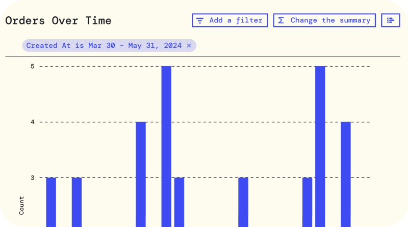
Define permissions and interactive tools for data discovery at scale. Give some people read-only access. Some drill-through on charts without saving. Others get an all access pass to create, modify, and save questions, create dashboards and more.

        
switch(currentUser.role) {
  case curator: {
    return (
      <MetabaseProvider config={config} theme={theme}>
        <InteractiveQuestion questionId={questionId} />
      </MetabaseProvider>
    );
    break;
  }
  default: {
    <MetabaseProvider config={config} theme={theme}>
      <StaticQuestion questionId={questionId} />
    </MetabaseProvider>
  }
}
return <GuestGreeting />;


UX by you

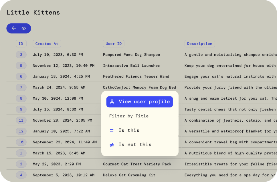
Customize the behaviors and flows per component, like adding custom actions to menu, or overhauling the layout of the query builder. There are no rules.

        
<MetabaseProvider
  config={config}
  theme={theme}
  pluginsConfig={{
    mapQuestionClickActions: (clickActions, clicked) => {
      const nextClickActions = [...clickActions]

      // If we are drilling down on the user id, add a custom action to view the user profile.
      if (clicked.column?.name === "user_id") {
        nextClickActions.push({
          buttonType: "horizontal",
          name: "view-profile",
          section: "info",
          type: "custom",
          icon: "person",
          title: "View user profile",
          onClick: ({ closePopover }) => {
            console.log(`View Profile > user_id = ${clicked.value}`)
            closePopover()
          },
        })
      }

      return nextClickActions
    },
  }}
/>


The right implementation type for whatever you need

Fast

Iframe embedding

For organizations that need embedded analytics really fast with little engineering overhead.
  • Charts, dashboards, and reporting in your app. Available as Interactive or Static.
  • Interactive embedding lets you white-label and set permissions with so customers can query, visualize, and drill-down on the data.
  • Static embedding lets your users see your data in a simple dashboard, but not click through into it.
Learn more
Interactive Embedding
Beta
Custom-fit

Embedded analytics SDK for React

For organizations that need bespoke in-app analytics. Everything you get with iframes with more control and flexibility.
  • Choose which components you embed, and where they’re placed for deep integration with your app.
  • Manage permissions and interactivity per component and user.
  • Granular theming for analytics that looks like part of your product.
Try the demo
Interactive Embedding
Still have questions? We’d be happy to help
Contact us